
Overview
Objective
︎︎︎Through rigorous research and analysis, I hope to find the correlation between type and emotion. I look to determine the basics of expressive letters that evoke those feelings. Following the understanding and research, I want to create a variable typeface that allows the user to work between these emotions when displaying their typographic works.
Research Questions
︎︎︎Are there connotations with existing typographic forms?
︎︎︎How does type influence one’s perceptions?
︎︎︎In what way can a letter be defined by abstract emotions?
Research Approach
︎︎︎In order to successfully deliver my intended outcome, I must approach this project with a rigorous and methodical approach. I plan to conduct numerous tests, surveys, and experimentations, of typographic examples. My hope is that through this extensive process, I am able to come to a conclusion of a working prototype typeface that is able to display some strong emotion.
Along with the testing, I also wish to conduct some secondary research through readings on interesting angles and thoughts surrounding the idea of type and emotions. This will help me determine what emotions to choose for my variable parameters. I will also like to look at design related studies that are similar to mine.

Secondary Research
Font Psychology
Emotion
Emotion
Font Psychology
︎︎︎Font psychology exists and is the understanding that type can influence one’s thoughts, feelings, and behaviors.
According to Sarah Hyndman’s book Why Fonts Matter there have been some studies exploring the association of type with emotion. In 1933, Poffenberger and Barrows conducted several surveys to determine what about type makes people perceive it a certain way. They started with simple line forms and eventually made their way up to testing which articles were funnier based off typeface.
The first experiment of lines showed to prove that people perceived the random lines by associating them with visually similar body characteristics that are displayed when feeling certain emotions. Slouching lines were deemed sad, jagged lines were angry or furious.
They went on to test further and discovered that a similar system was true with shapes as well. When we see rounder, softer blob like shapes, we associate those with friendly or happy just like round, soft babies. Same goes with unfriendly associations with jagged edges similar to that of dangerous teeth or sharp corners
Taking into account the studies that Hyndman presents in her book, I will be using these as reference when it comes to completing my final product. Looking at the results of the Poffenberger and Barrows experiments will definitely play a role in my understanding of how shapes affect our emotional perception.
Emotion
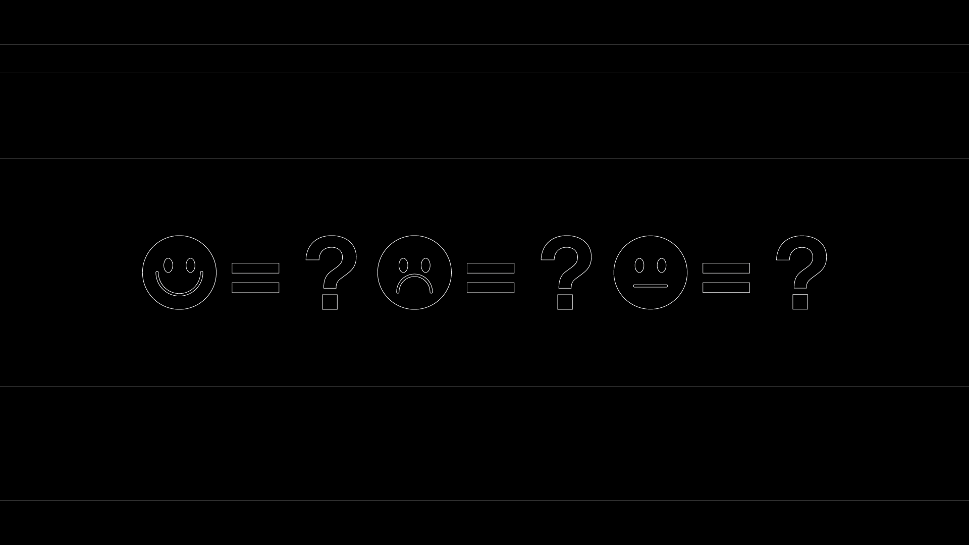
︎︎︎Human emotions are natural state of minds that derive from our given circumstance, mood, relationships, and many other factors. The studying of emotions and what they are dates back to centuries ago. Humans have always felt some sort of emotion, however narrowing down what the basics are have been often debated. Many psychologists have done studies to try and narrow down the list of basic emotions to a small number, while others have determined primary emotions that expand out to secondary and tertiary emotions.
For the purpose of my thesis, I wanted to target the basic and most agreed upon emotions to help create my emotional typeface. Looking at studies by William James, Paul Ekman, Richard and Bernice Lazaraus, and Robert Plutchik, I had originally chosen to pursue Happiness/Joy, Sadness, Anger/Rage, and Calm/Content. Later on, you can see that I chose to omit Anger and Calmness. This is because unlike Happiness and Sadness, the direct opposition is not as strong between these two and may led to confusion with my outcome.

Survey Testing
Survey 1: Found Type
Survey 2: Vectorized
Survey 3: Lorem Ipsum
Survey 4: A’s
Survey 2: Vectorized
Survey 3: Lorem Ipsum
Survey 4: A’s
︎︎︎Survey 1: Found Type
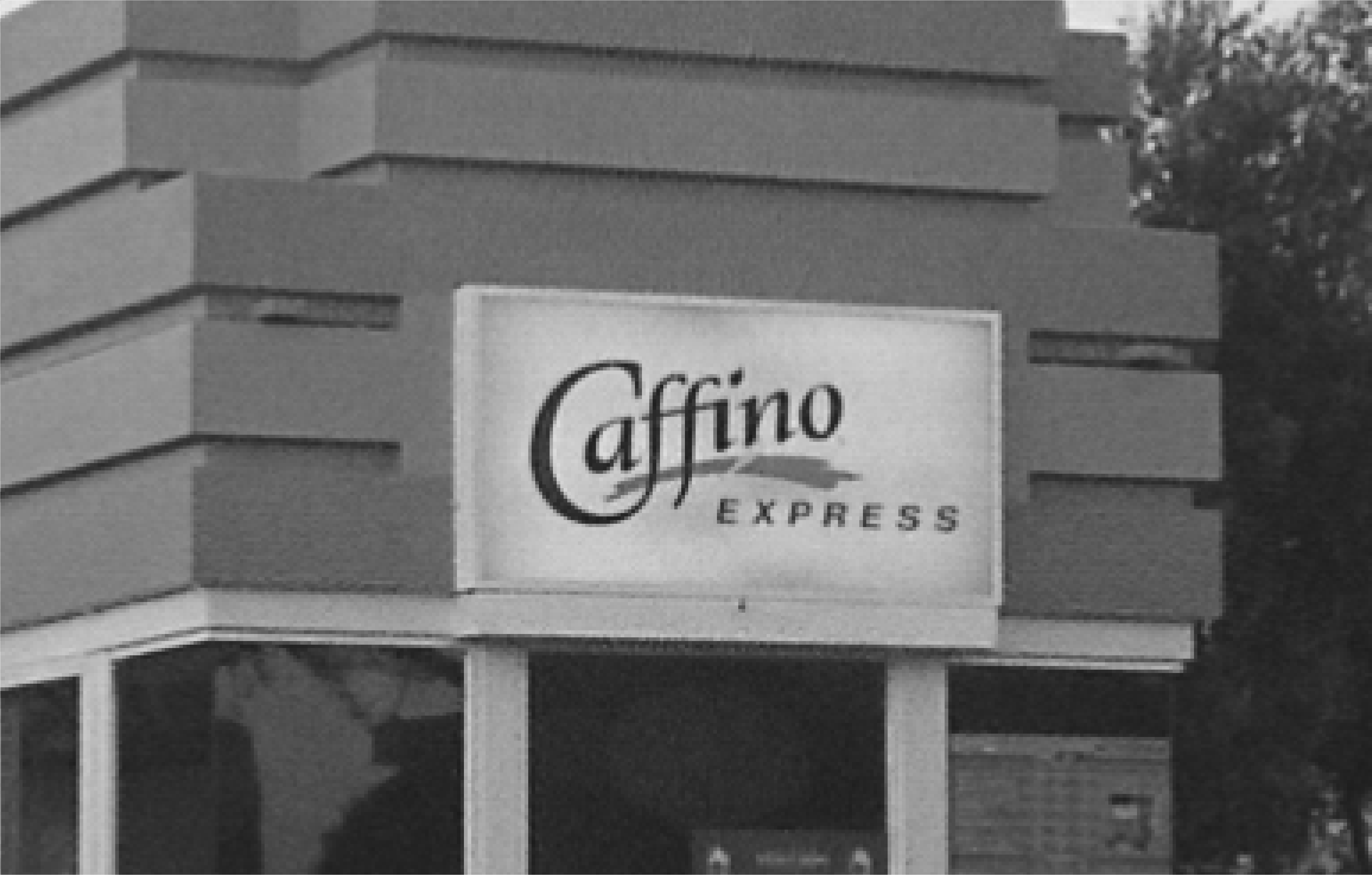
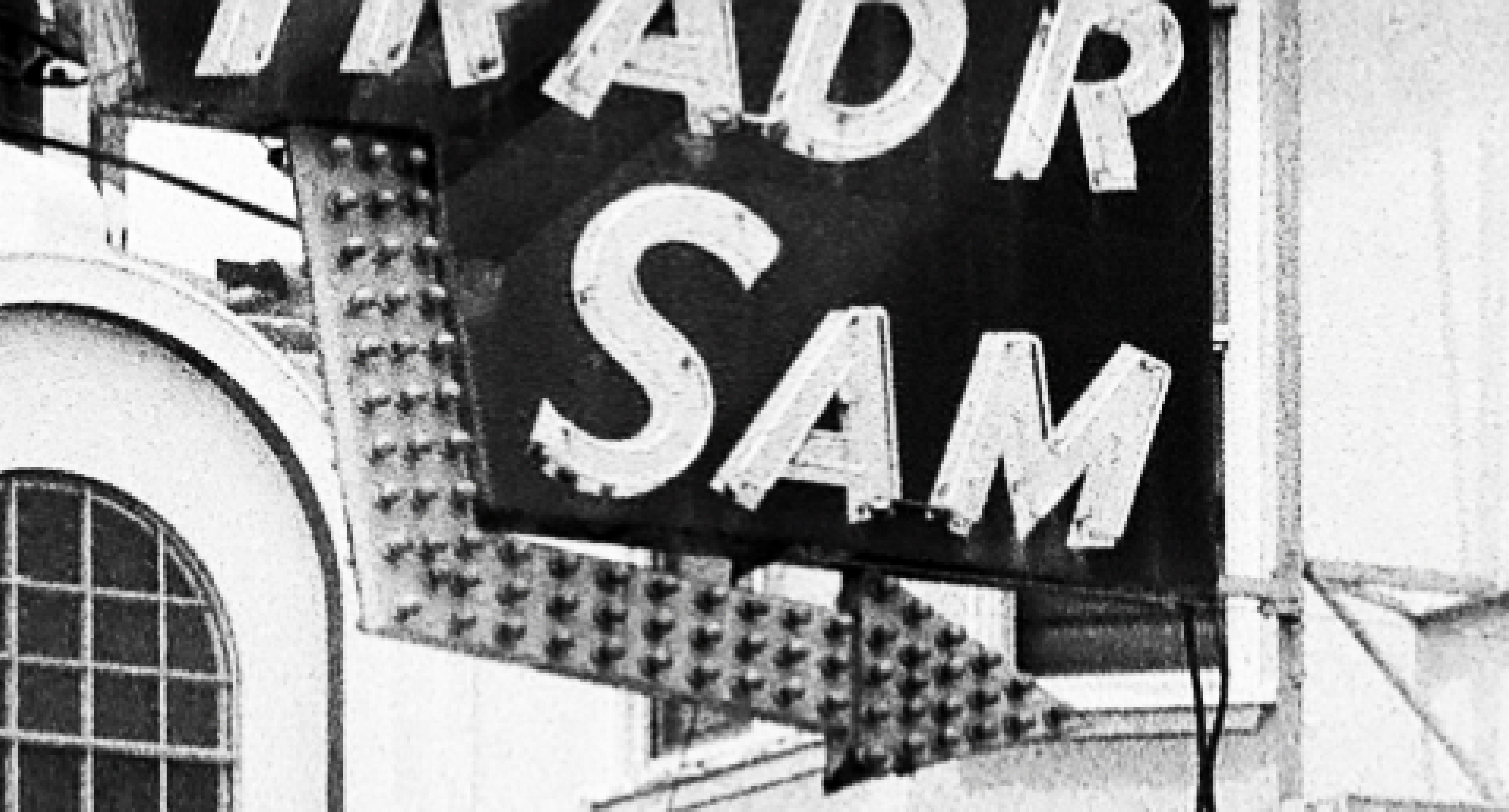
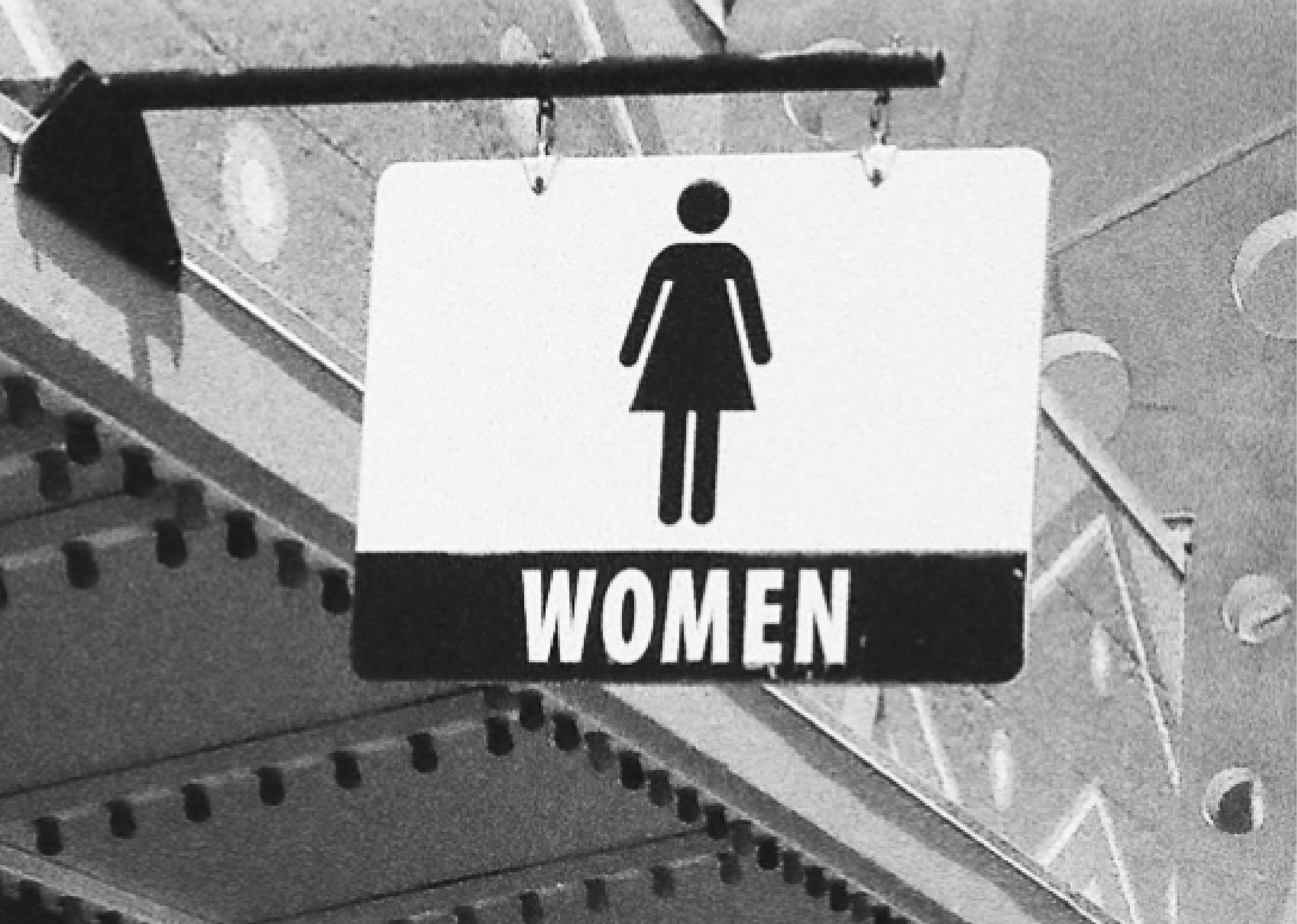
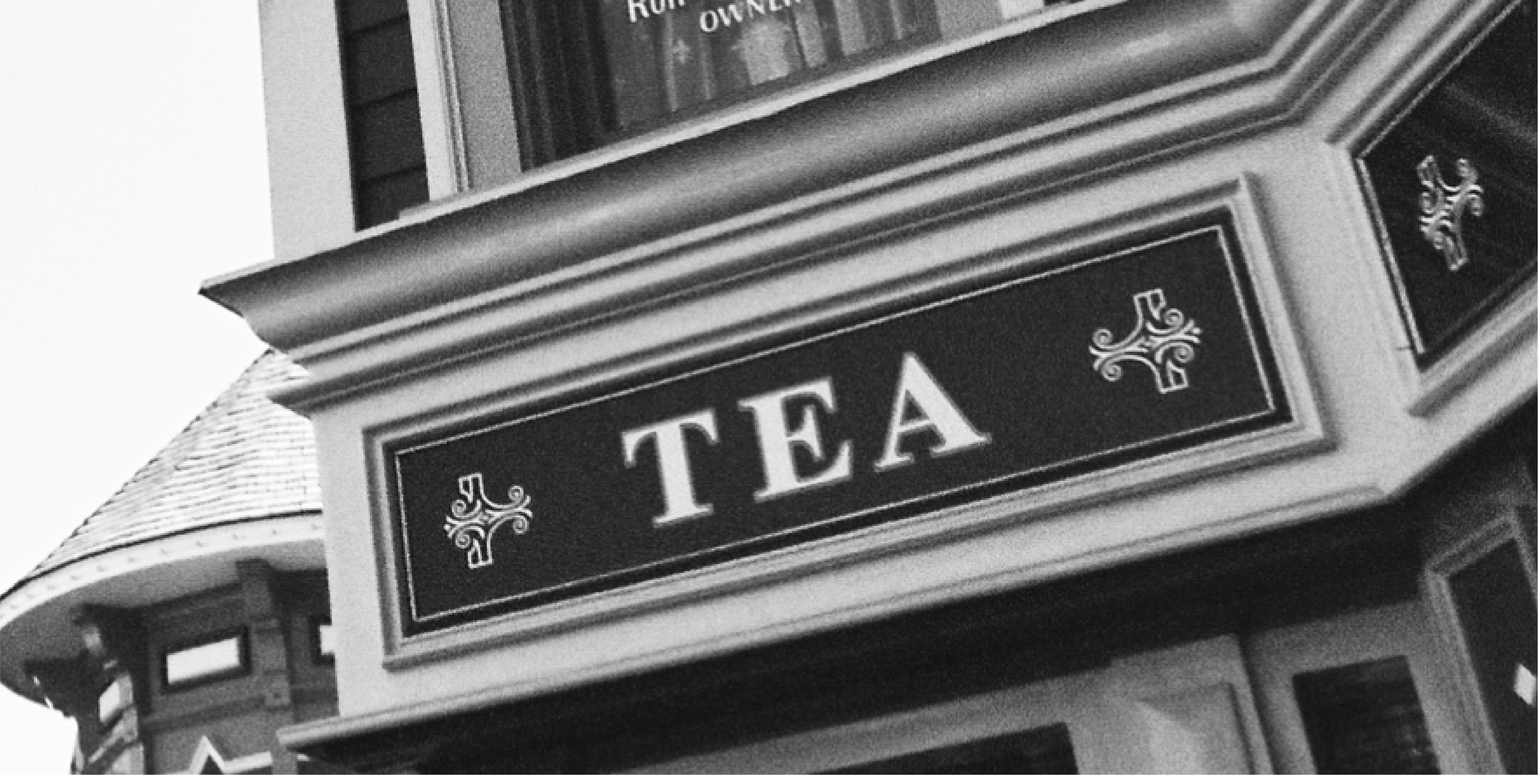
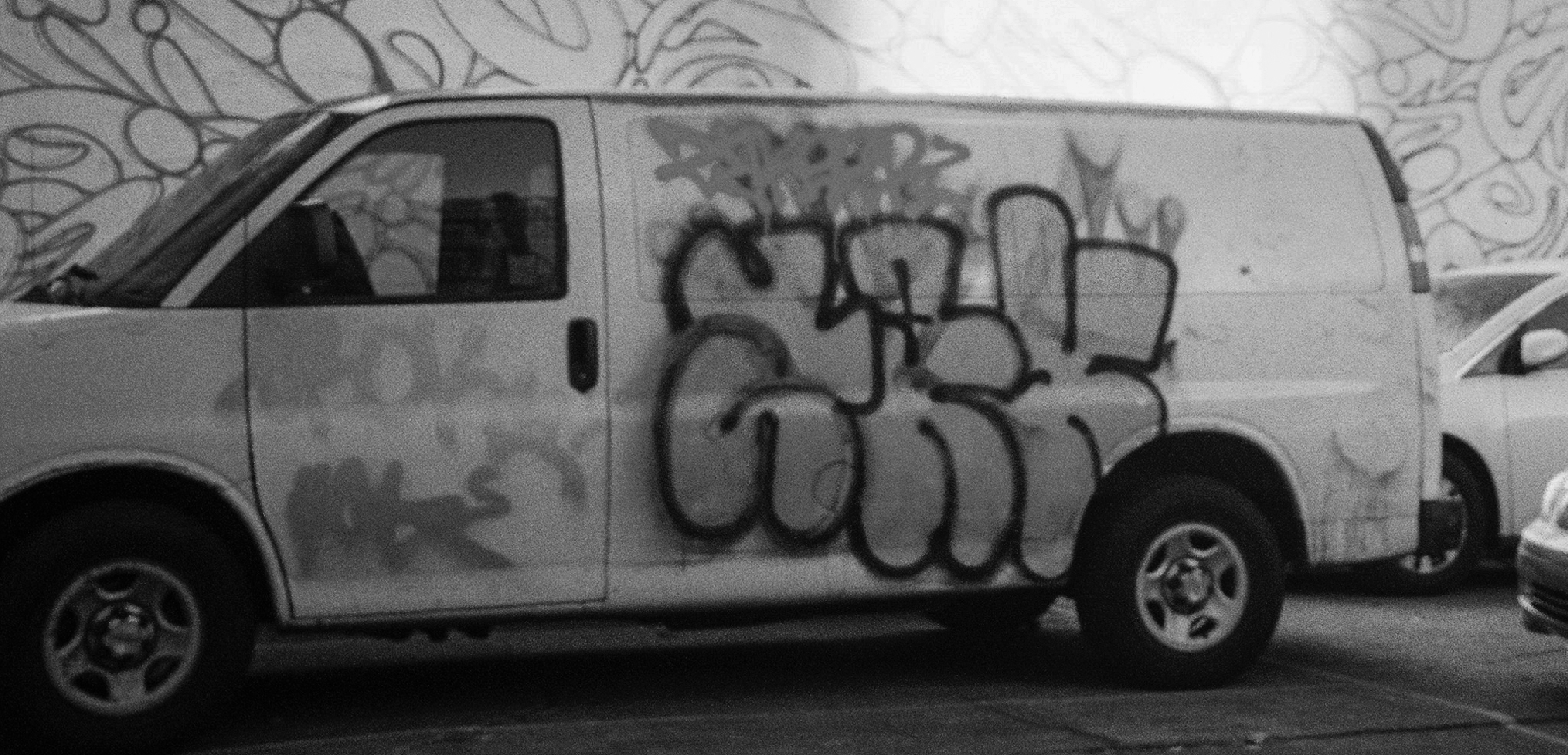
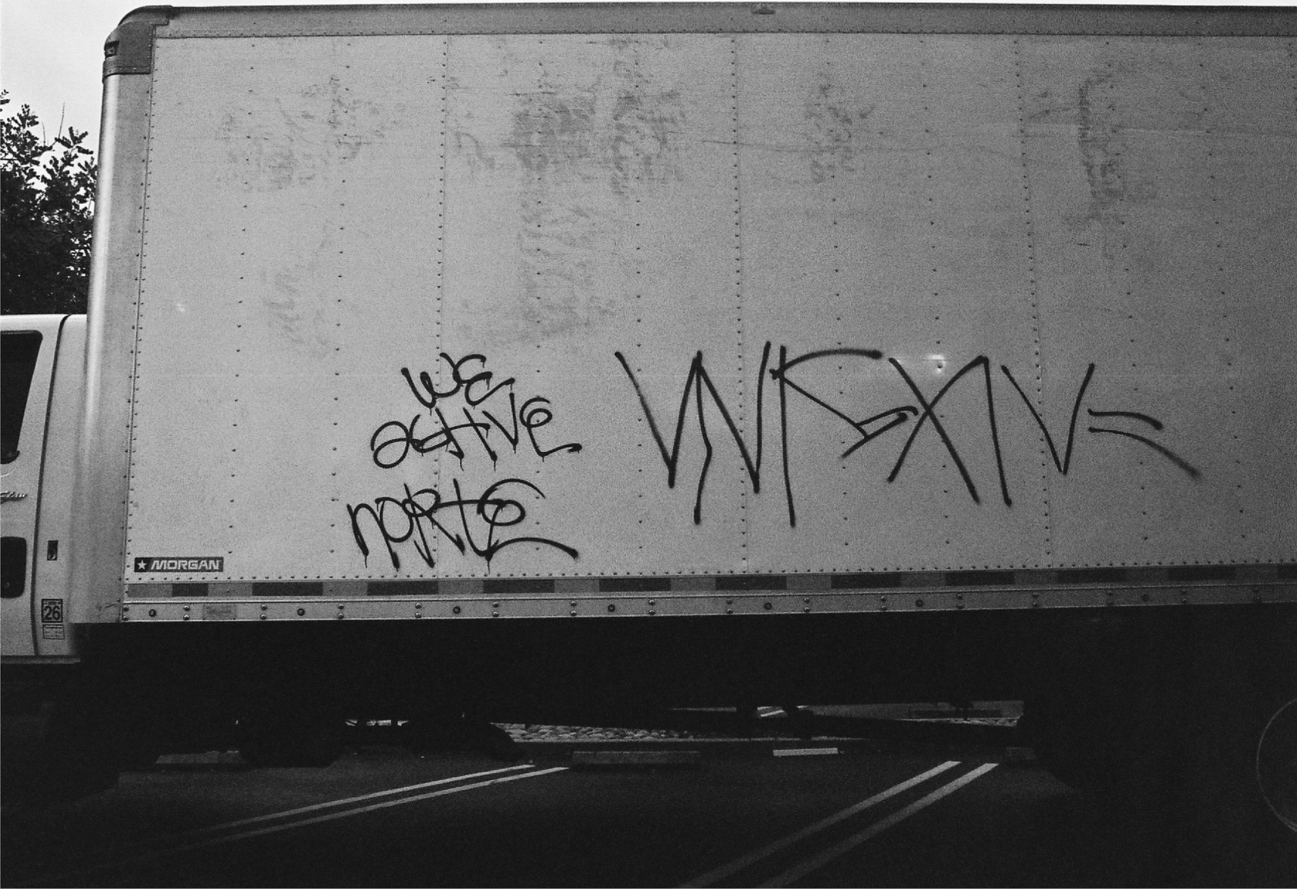
︎︎︎My first survey consisted of a set of real world typographic examples. These images ranged from store fronts, street signs, graffiti, and more. This wide range of typographic assets were used with the intention of seeing how the general public views different type of characteristics that they would encounter in their everyday lives.
This survey presented takers with an image along with 3 multiple choice options. The instructions stated that for each image select which feeling or emotion the image looked like; Happy or Sad, Angry or Calm, and Loud or Quiet.
Section two of the survey asked takers to compare two different typographic examples and decide which one was louder.
Every question also had an “Unsure/Neither” option. This was added to assist me in deciding what examples lacked clear emotion evoking characteristics and to avoid any misguided results
Section 1
20 Typographic Examples
Section 2
10 Typographic Examples
5 Comparisons


Survey 1 Results
︎︎︎For this survey, I received 54 participants. This led to each image receiving 54 votes in each category, Happy vs Sad, Angry vs Calm, and Loud vs Quiet. Here I present the top three recipients of each of those results. However, I have chosen to omit Loud vs Quiet as it is not an emotion, but instead a indicator of how expressive an emotion may be.
︎︎︎For this survey, I received 54 participants. This led to each image receiving 54 votes in each category, Happy vs Sad, Angry vs Calm, and Loud vs Quiet. Here I present the top three recipients of each of those results. However, I have chosen to omit Loud vs Quiet as it is not an emotion, but instead a indicator of how expressive an emotion may be.
Happy
![]() ︎︎︎54 Votes
︎︎︎54 Votes
![]() ︎︎︎50 Votes
︎︎︎50 Votes
![]() ︎︎︎39 Votes
︎︎︎39 Votes
 ︎︎︎54 Votes
 ︎︎︎50 Votes
︎︎︎39 Votes
︎︎︎50 Votes
︎︎︎39 VotesSad
![]() ︎︎︎36 Votes
︎︎︎36 Votes
![]()
︎︎︎23 Votes
![]()
︎︎︎22 Votes
 ︎︎︎36 Votes
︎︎︎23 Votes
︎︎︎22 Votes
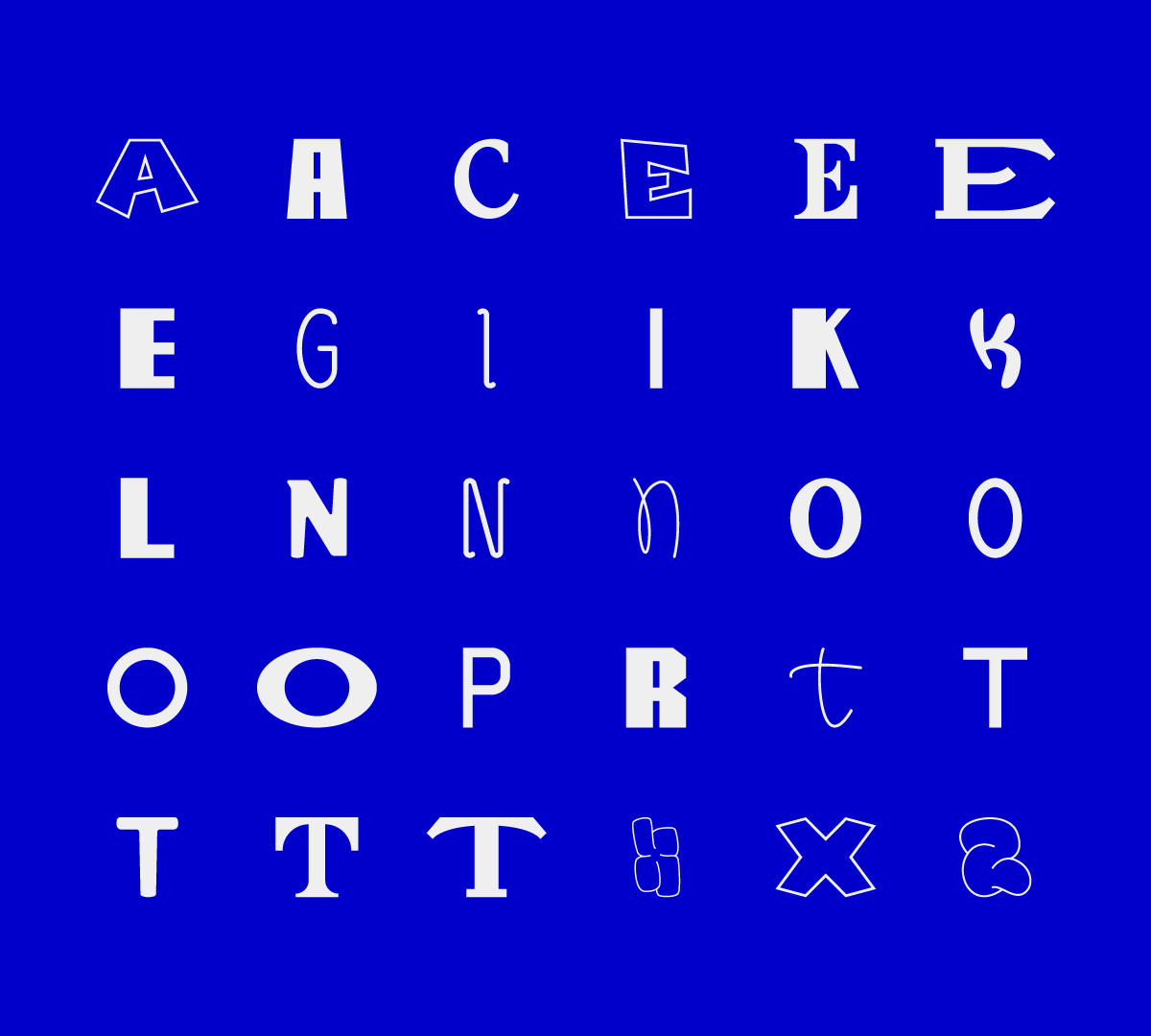
︎︎︎Survey 2: Vectorized
︎︎︎Following the results of the first survey, I gathered the examples that presented emotion evoking potential and vectorized certain letters. This allowed me to remove any feeling from the way the photograph was taken, the place it is presented, and the meaning of the word that it had spelled out. Observing only those that received over a third of votes in the Happy or Sad category.
Taking 30 vectorized letters, I asked survey takers to determine if happy or sad can be perceived from a single letter form. Similar to the last survey, a third option of “unsure/neither” was also presented in the case that a letter was not emotionally expressive enough to convey happy or sad. I had also asked an optional question that allowed takers to describe what they felt made a letter look happy or sad.
Main Section
30 Typographic Examples
Optional Response
Feedback and Thoughts
Survey 2 Results
︎︎︎In this survey, I received 54 participants, thus 54 possible votes for each letter. Here I have displayed all letters that received over a third of the votes in either happy or sad. They are they categorized from most happy (left) to most sad (right)
Some of the letters recevied mixed results in which they received a significant amount of both happy and sad letters. I had chosen to omit those in order to not skew the data. This leaves me with a total of 19 letters that come from 9 different photos in the first survey.


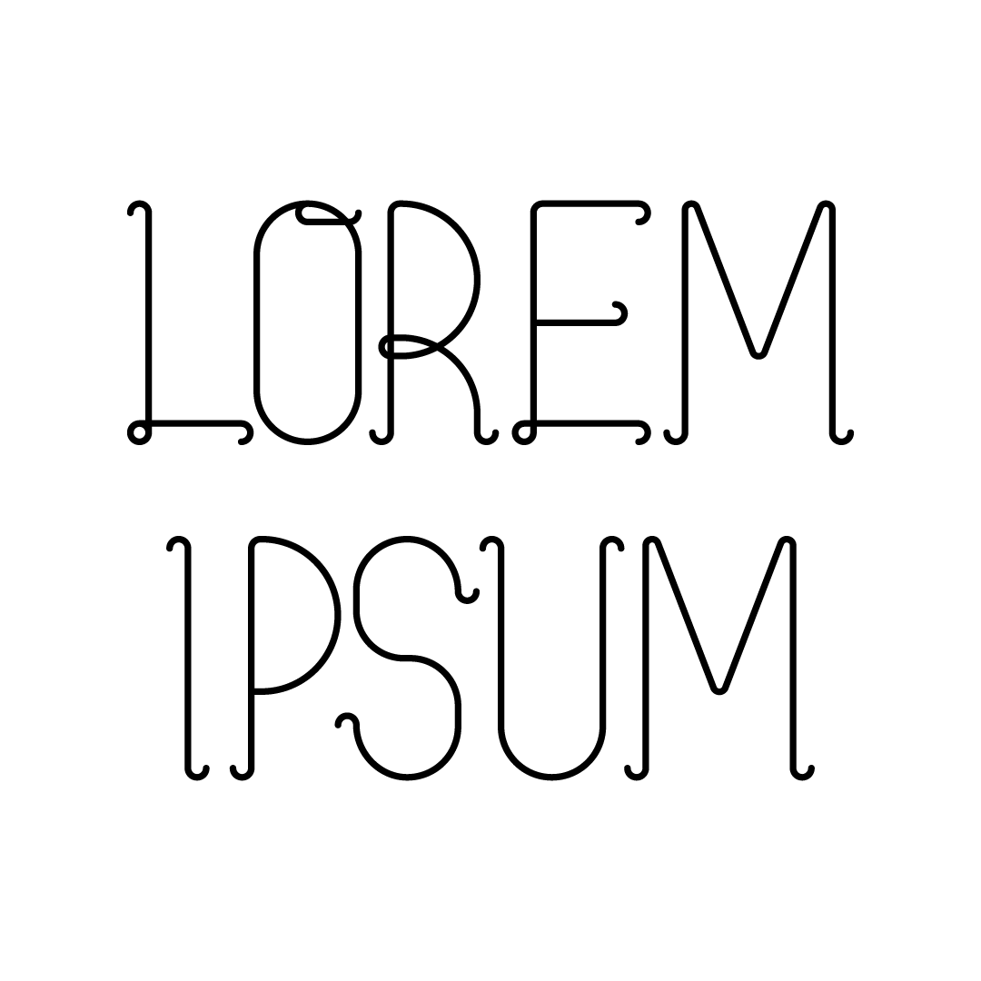
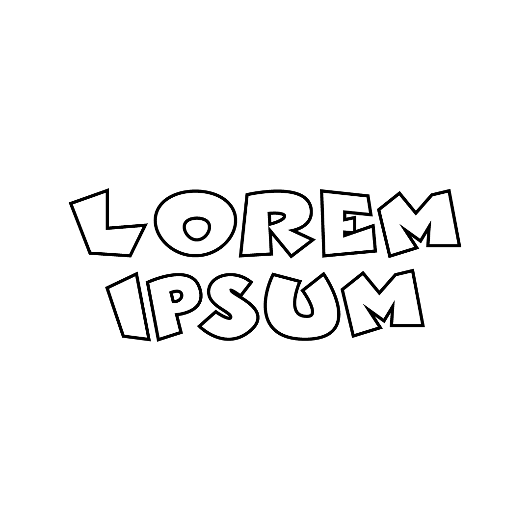
︎︎︎Survey 3: Lorem Ipsum
︎︎︎Using the individual letters from the previous survey, I created several typographic examples reading “LOREM IPSUM” in all capital display. I used both the letters from survey two along with the feedback from the optional responses to create five examples that will help me determine what style of letters are happier or sadder in comparison to the others. Lorem Ipsum was used to neutralize the meaning of the type.
Five display LOREM IPSUM examples are presented to survey takers. They will rate each one from 1-5, with one being sad and five being happy.
Survey
5 Custom Display Types
Five display LOREM IPSUM examples are presented to survey takers. They will rate each one from 1-5, with one being sad and five being happy.
Survey
5 Custom Display Types
Survey 3 Results
︎︎︎With the lack of conclusive results, I decided to take a step back and omit the results of Survey 3 as it lacked any strong evidence of emotion in the typographic forms. My take away following this conclusion and chatting with advisors is that I should shift my parameters into something that is more known and applicable in real life situations.
From this point on, I am comparing the friendliness and the aggressiveness of letter forms, along with if it is perceived as luxurious or affordable/modest. This wider range of friendly vs aggressive allows letters to fit the category more as it seems like many survey takers struggled with the idea of a sad looking letter. My addition of luxurious and affordable letter forms comes from the idea that a letter can look friendly, however may not be used if the idea need to be perceived is not correct. In a real example, a jewelry store may want to come off as friendly however they might not want to come off as affordable, and that’s where the introduction of this secondary parameter fits into play.


︎︎︎Survey 4: A’s
︎︎︎Taking the data from survey 2, I created 20 different forms of the letter A. With these letter A’s, I asked survey takers to answer if a letter was friendly or aggressive and luxury or affordable. Many of the letters are from the previous survey 1 and 2, however some of them were created based off characteristics in the free response section.
Twenty letter A’s are vectorized and isolated from any other form or image. Survey takers must answer which category they feel the letter fits into bests.
Survey
20 A’s
Twenty letter A’s are vectorized and isolated from any other form or image. Survey takers must answer which category they feel the letter fits into bests.
Survey
20 A’s


Survey 4 Results
︎︎︎In this survey, I received 35 participants. With the 35 results I received per section, I was able to plot all my points on a four quadrant grid system that allows me to visually see any trends. Taking the data of each participant’s results, I was sable to plot down approximations as to where each letter A should be based off number and relation to one another. Following this sort of organization, I proceed to make two list to demonstrate the friendliest to most aggressive and most luxurious to most affordable.

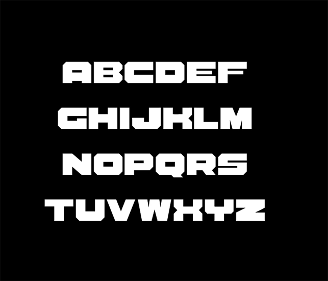
The Feels Typeface
Initial Sketches
Changes & Iterations
Final Outcome
Changes & Iterations
Final Outcome
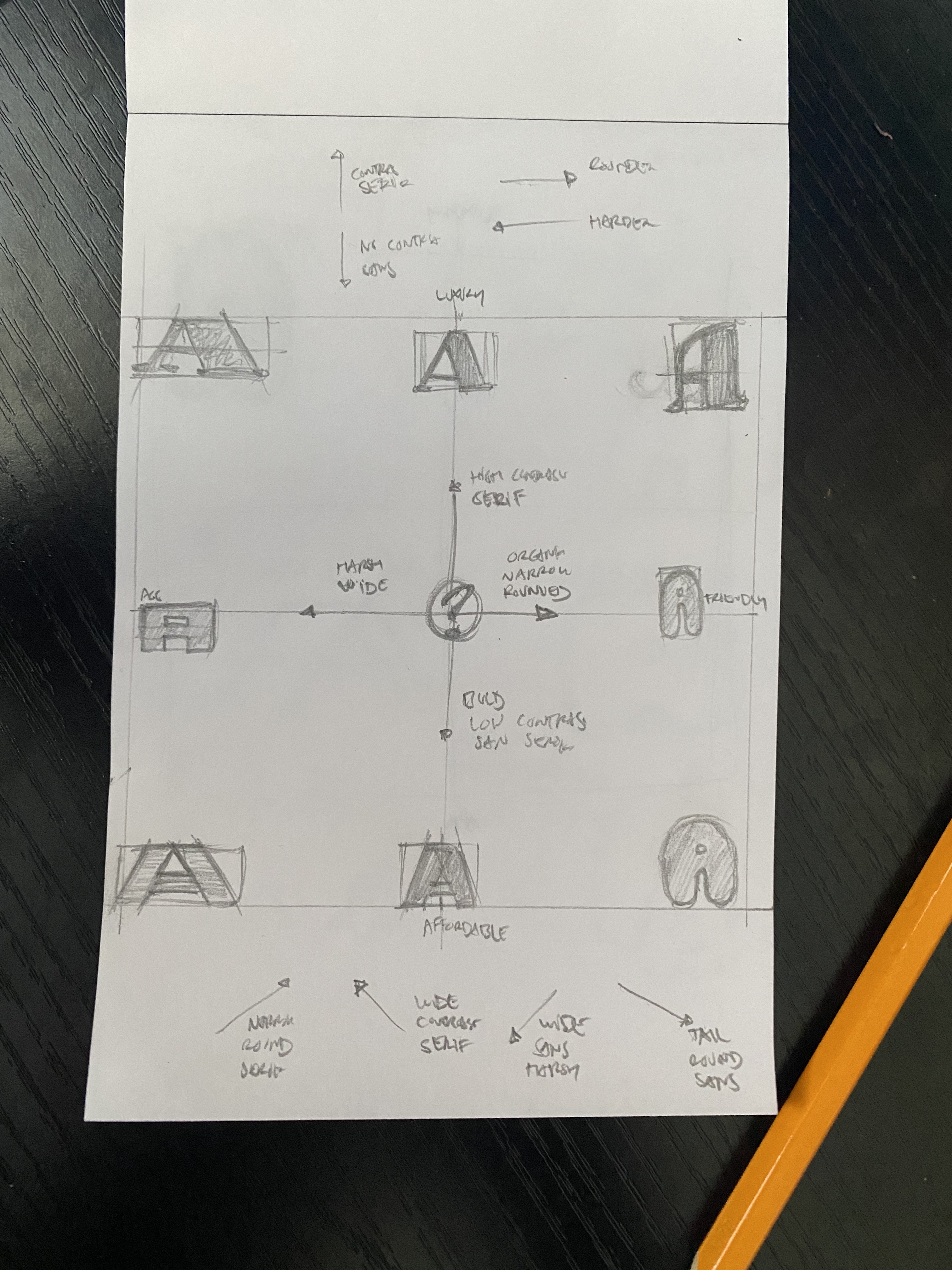
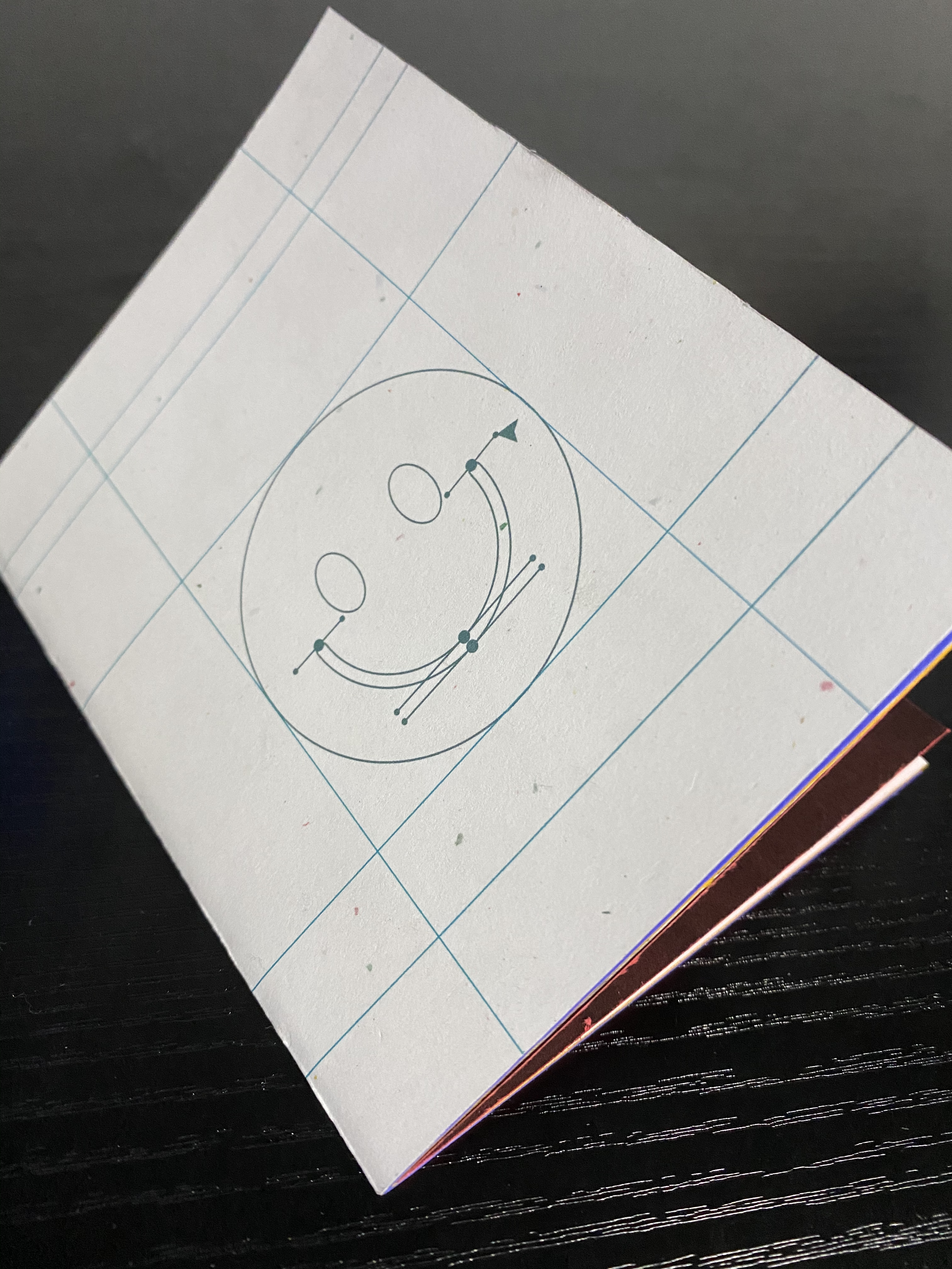
︎︎︎Initial Sketches
![]()
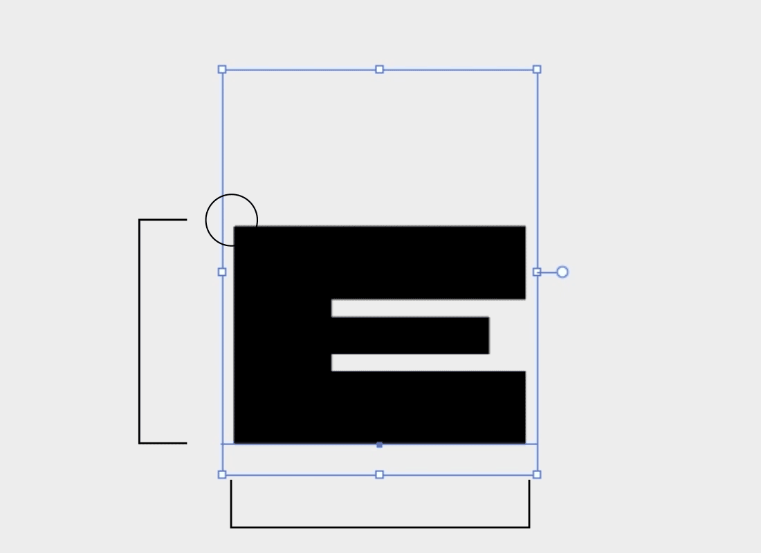
︎︎︎Using my collection of data along with my developed understanding from the secondary research, I began to sketch ideas that I felt would fit the criteria required for each master in my variable font. What I realized I had to do, to accomplish a smooth transition between phases of my font, was to create a total of 9 masters, one for each extreme, each corner of the quadrant, and a middle neutral font. Here are some initial hand and digital sketches that I have created.
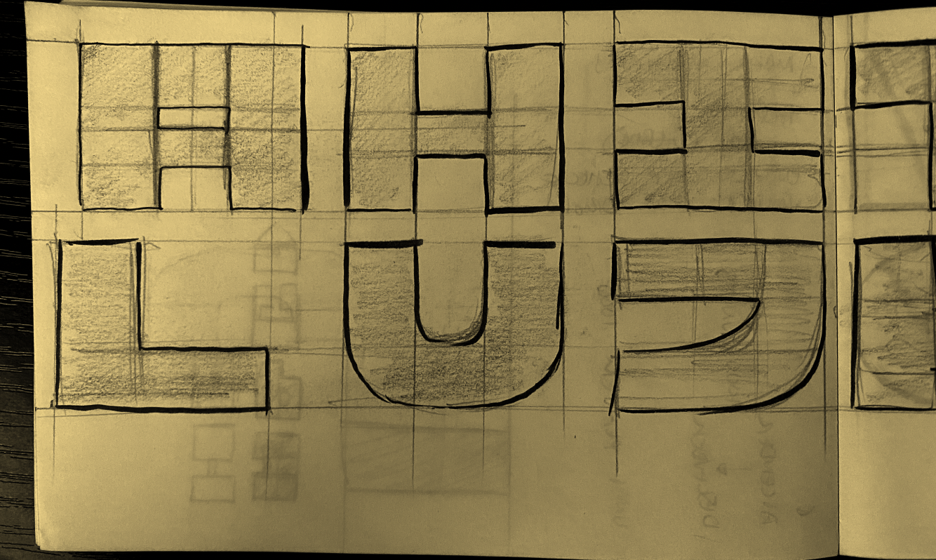
These are sketches for the maximums placed on a 4 quadrant grid. Notes are also presented to describe how a font might change depending where it moves along the grid. For example, a font moving toward the lower left — Aggressive and Affordable — will typically be wider, bolder and overall more of an even line weight throughout.
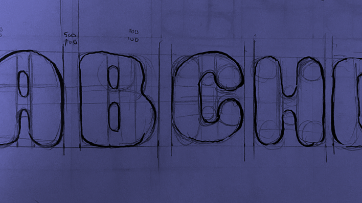
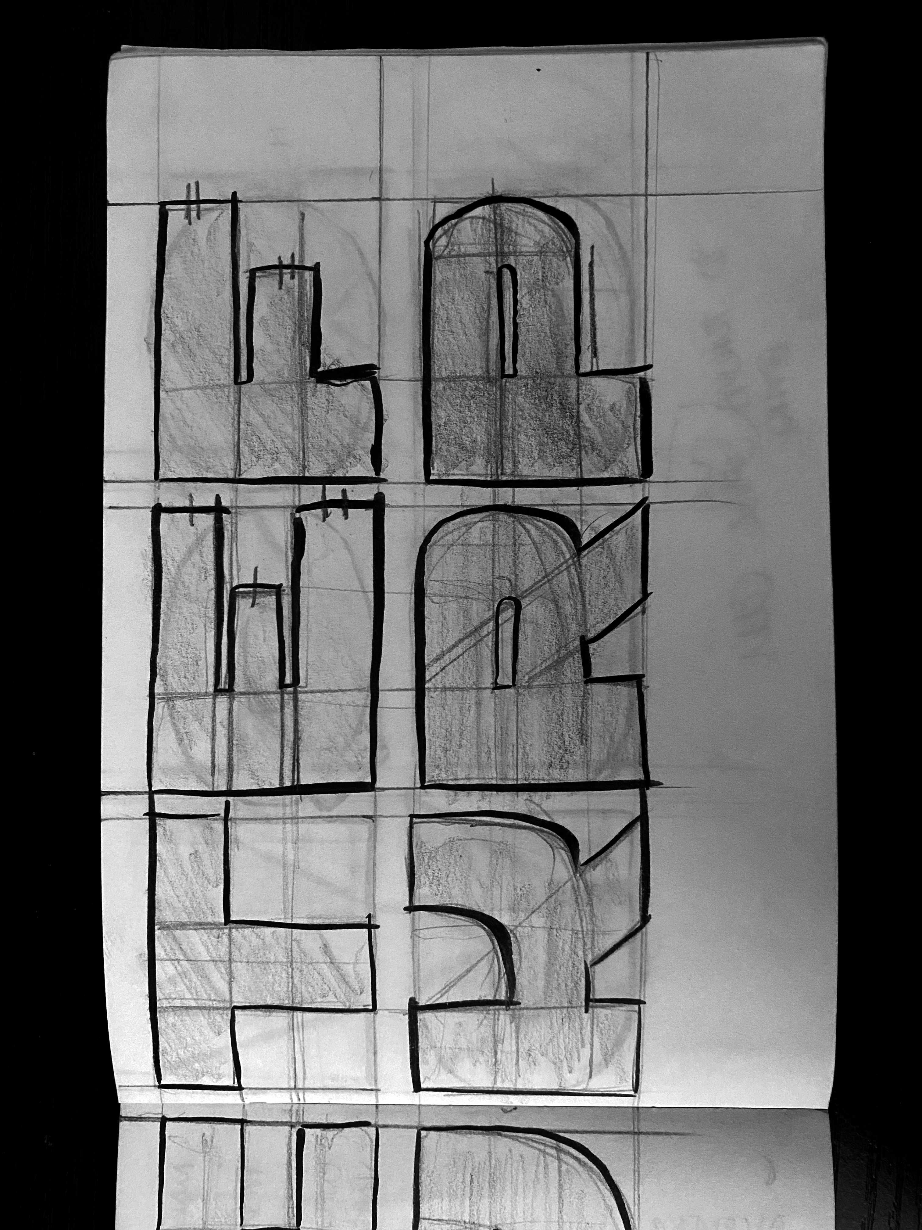
︎︎︎Changes and Iterations
![]()
︎︎︎Throughout the sketches and vectorizing of letters, numerous versions of each possible letter were thought out. Some changes were more apparent than others, however all the details from points to curves were meticulously worked on.
![]()


With the complexitiy of the proposed nine master typeface, the results of the first prototype were not ideal. Moving using only one of the sldiers would make decent letterforms however with the introduction of the secondary type, the letterform becomes lost and a bit crude at the “in between” variants.
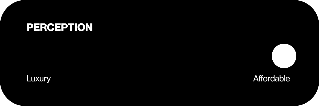
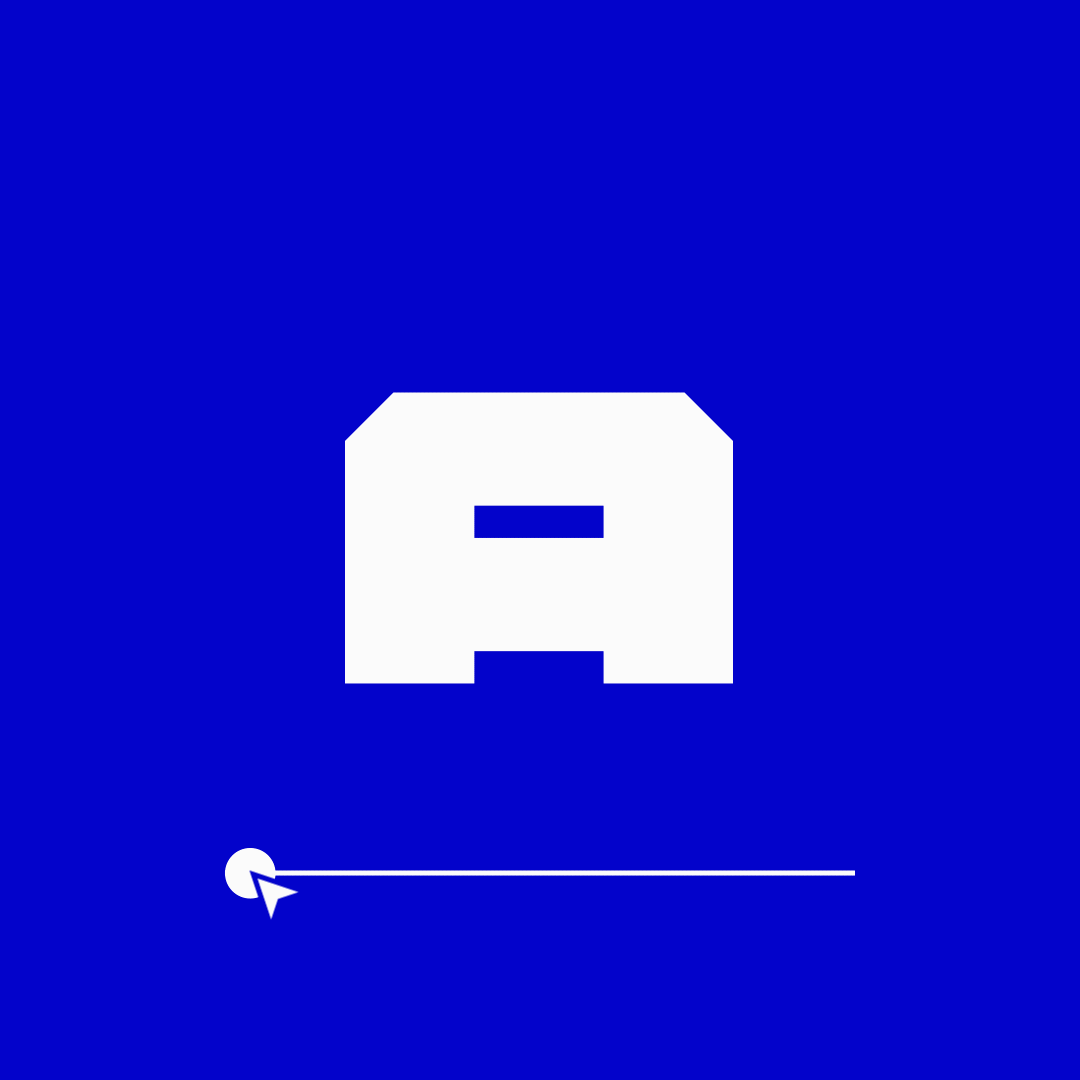
To solve this issue, I chose to seperate the two varying parameters to create two seperate weights. These two were categorized as Perception and Emotion. Perception would allow the variablity between Luxury and Affordable in a type while the Emotion weight used Friendly and Aggressive as the ends of itss spectrum. This change of pace still uses the research that I have conducted, just altered in how it is presented.
To solve this issue, I chose to seperate the two varying parameters to create two seperate weights. These two were categorized as Perception and Emotion. Perception would allow the variablity between Luxury and Affordable in a type while the Emotion weight used Friendly and Aggressive as the ends of itss spectrum. This change of pace still uses the research that I have conducted, just altered in how it is presented.
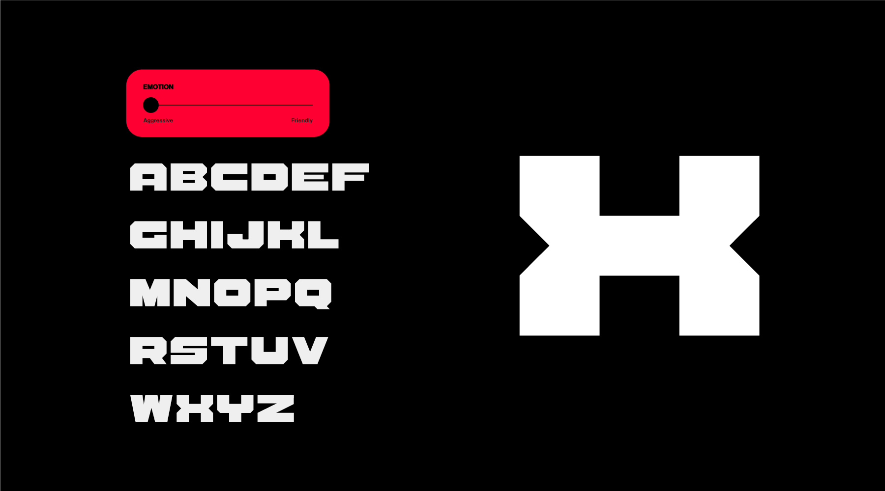
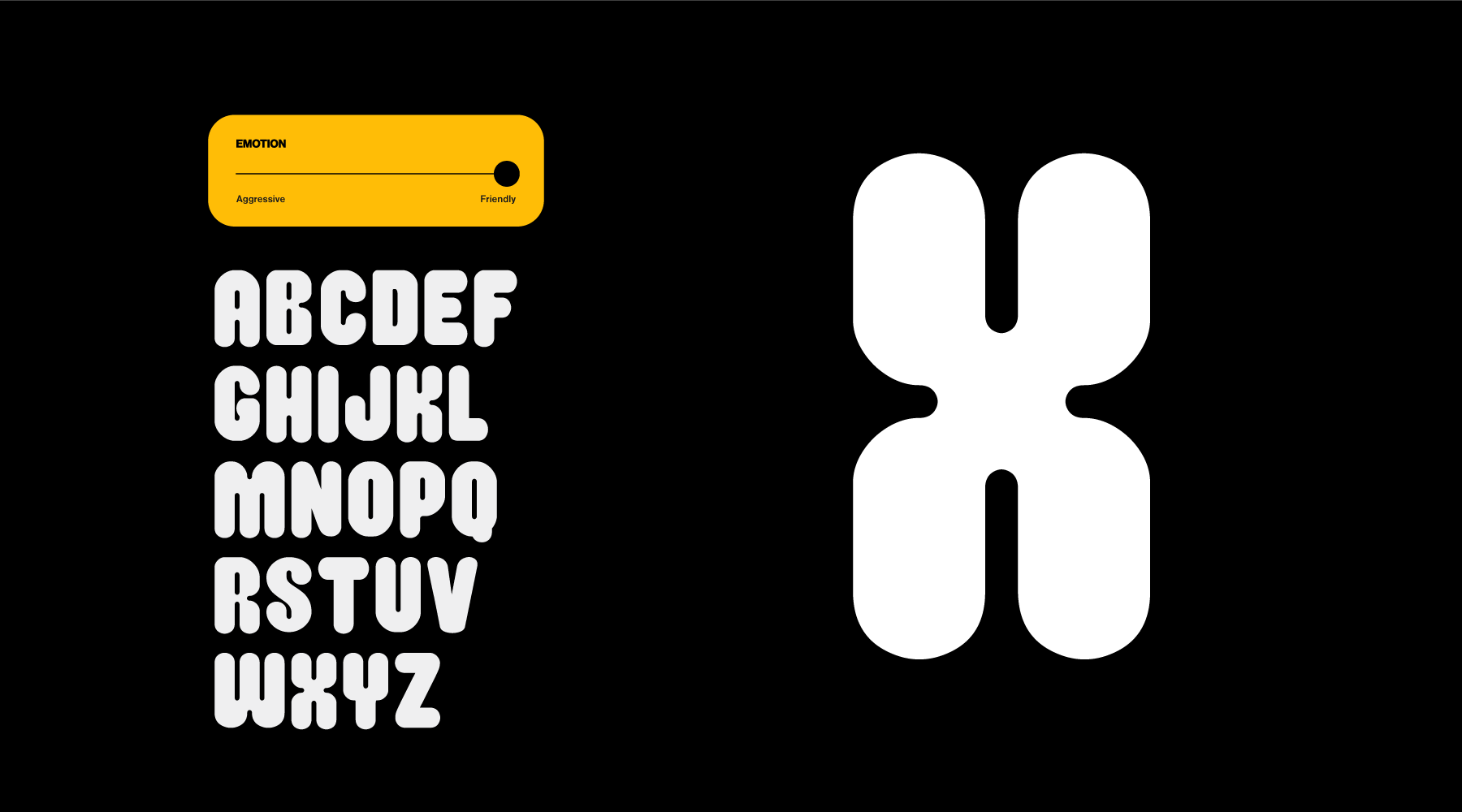
︎︎︎Final Outcome
︎︎︎The Feels Typeface is the result of all my research, surveyin, and iterations. Once the font was completely drawn, I switched over to the Glyphs program where I was able to add the variable functions so that the letters would transition from one to another.
The split between perception and emotion allows for more flexibility and usability in the overall typeface. Narrowing it down to just the two categories with a single parameter each makes the current version of the type work at its best.
The split between perception and emotion allows for more flexibility and usability in the overall typeface. Narrowing it down to just the two categories with a single parameter each makes the current version of the type work at its best.
Type Speciman
︎︎︎To properly display the font in a usable way, I was able to prepare a type speciman booklet where examples can be seen as well as general information about the font is found
︎︎︎To properly display the font in a usable way, I was able to prepare a type speciman booklet where examples can be seen as well as general information about the font is found

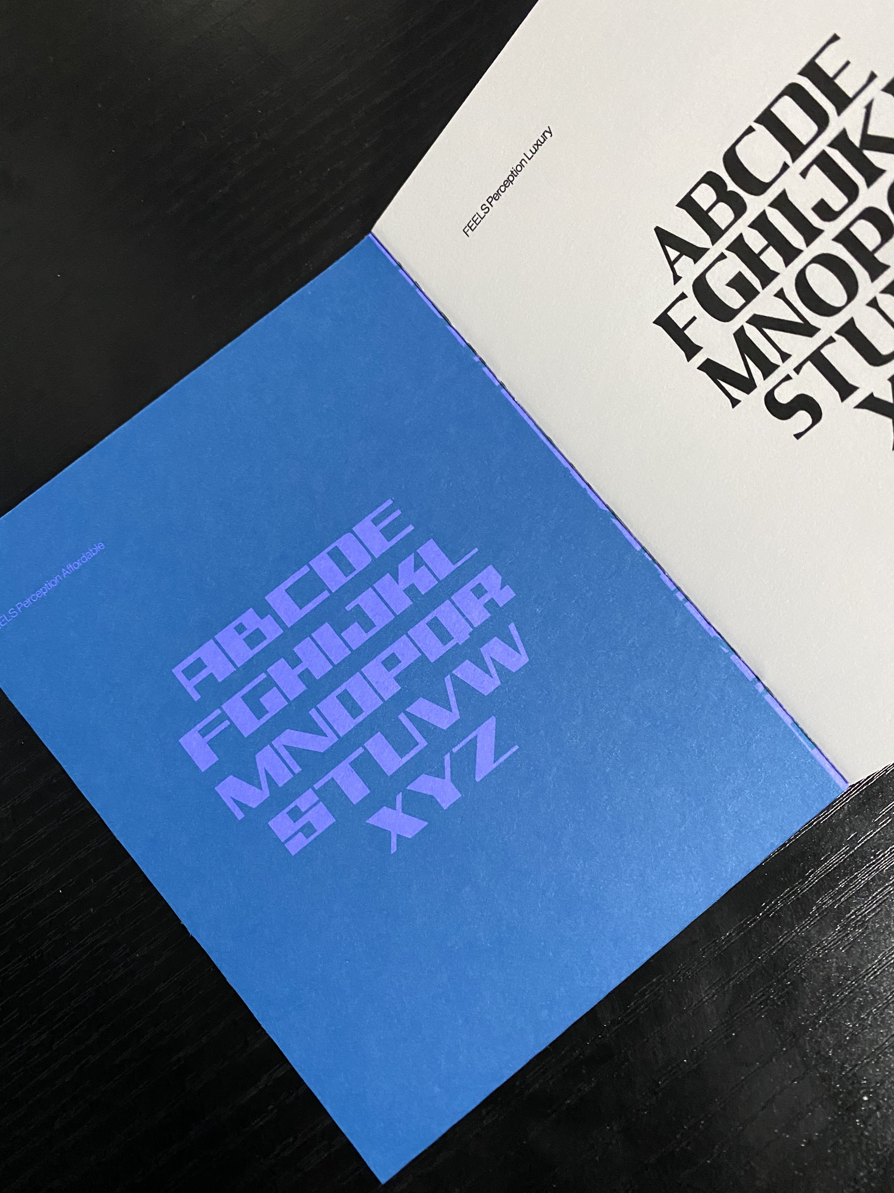
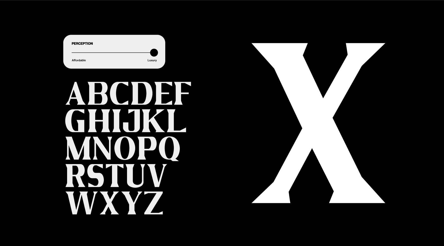
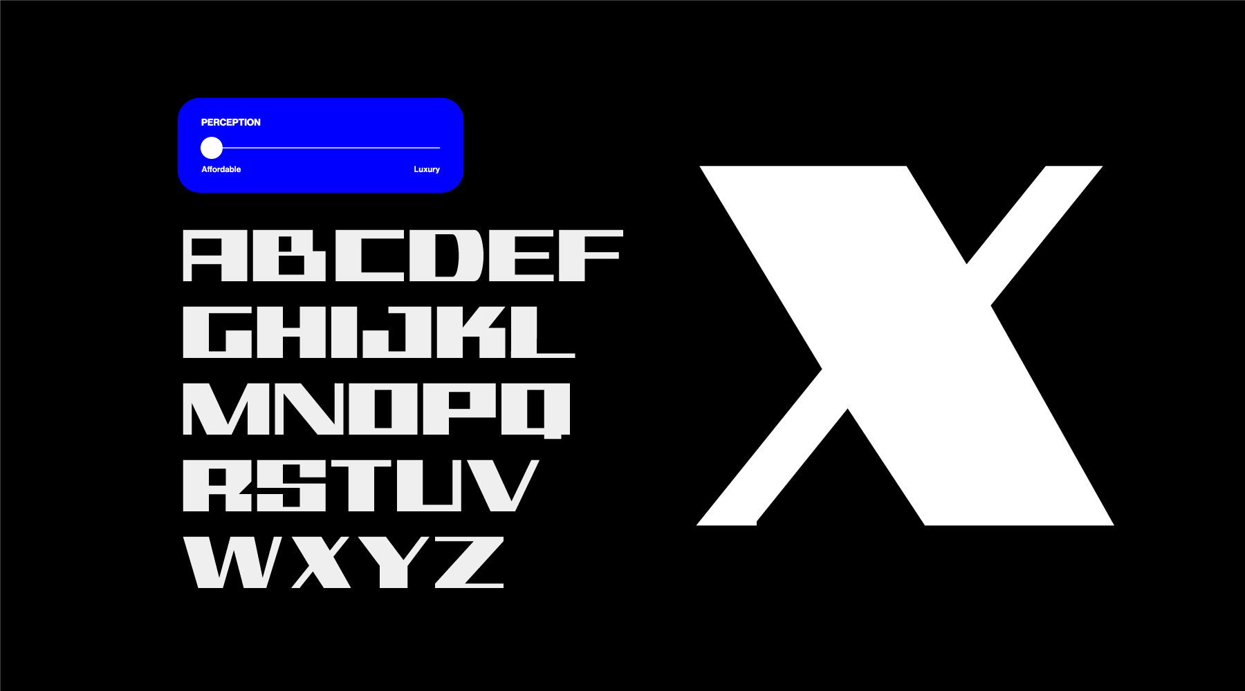
 ︎︎︎Perception Affordable
︎︎︎Perception Expensive
 ︎︎︎Emotion Friendly
 ︎︎︎Emotion Aggressive
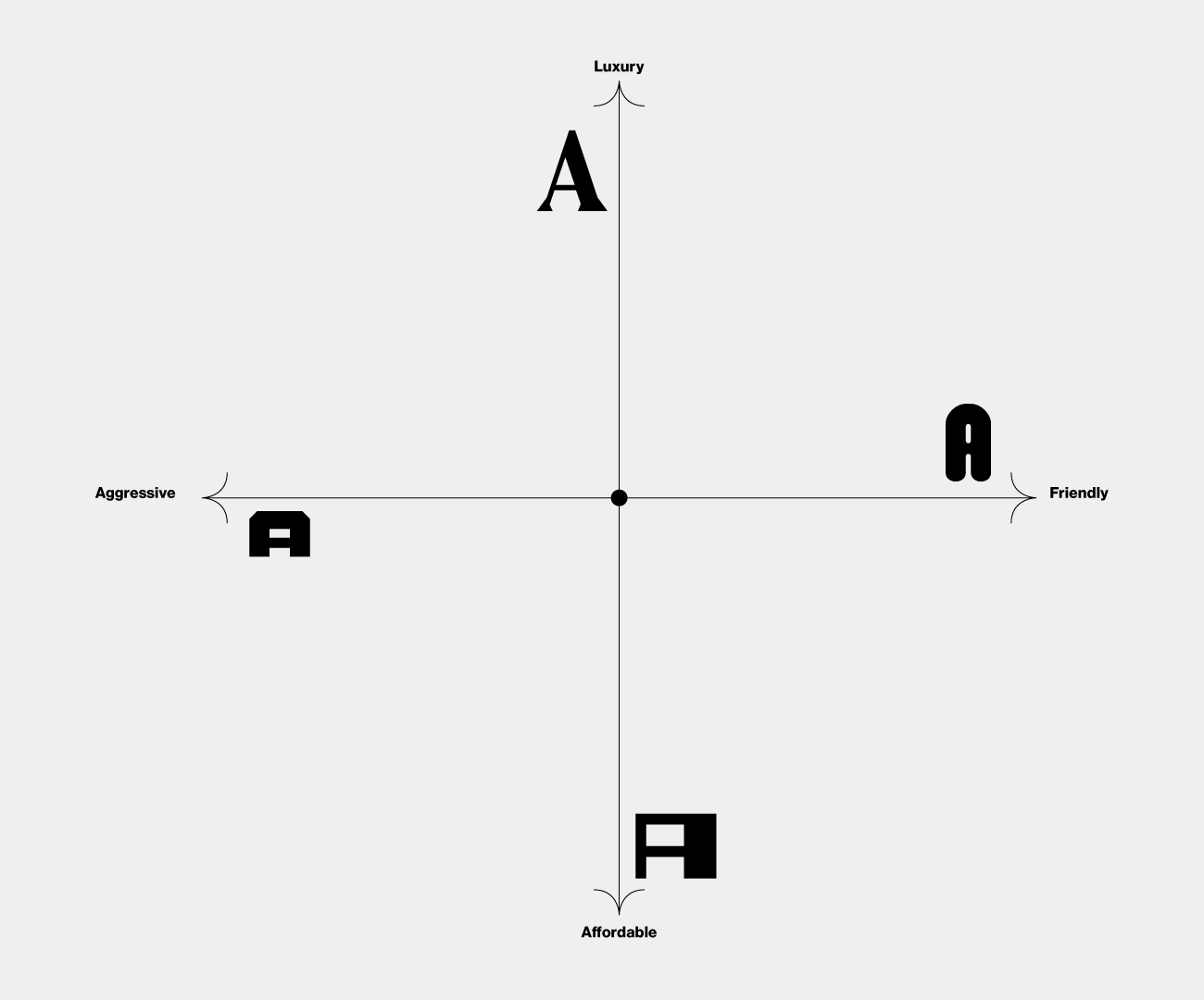
︎︎︎With the current status of this project, I believe that I can continue to pursue the development of the intended two parameter typeface. Of course, given this goal it would take much more time to complete this type of task, however, the foundation of that is successfully laid out through this rigorous final outcome.
Conclusion
Research Questions
Lessons Learned
Lessons Learned
︎︎︎Research Questions
︎︎︎Are there connotations with existing typographic forms?
To answer the first question, I look primarily to my secondary research. Based off of the studies that I looked at, there have definitely been other designers who have looked at the idea of type carrying some sort of connotations. This idea comes from font psychology. Fonts play a role in influencing viewers based on the way they are created . All aspects of a letter are taken into consideration including style, width, height, weight, etc. Some notable existing connotations are that rounded letter forms are friendly as it relates to softer shapes, jagged edges and corners are harsher such as in graffiti, and fonts are chosen based off target audiences. These connotations are looked at by designers when choosing fonts to promote their brands or work.
︎︎︎How does type influence one’s perceptions?
Type can affect the perception based off of its style. This goes back to the idea of font psychology, however now so much in the structure aspect, but more the connotations. Fonts in everyday lives are often overlooked, however, certain styles are unknowingly associated with certain perceptions. For example, based off my studies, graffiti or roughly done handwritten like letter forms are typically associated with a more negative sort of brand identity. People view most graffiti in a negative light and this is due to the associations people see in the real world. Same goes with traditional serif fonts. Many see traditional serifs like Baskerville and associate it with something of high importance or age. Although this can be a negative as it introduces a sort of class amongst type design, modern day design has been seen to take these fonts and integrate them in other ways to break that connotation that others perceived it as.
︎︎︎In what way can a letter be defined by abstract emotions?
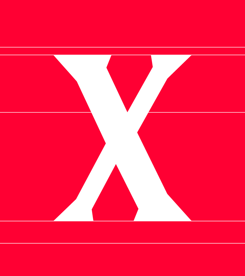
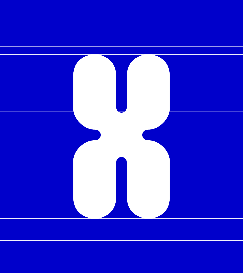
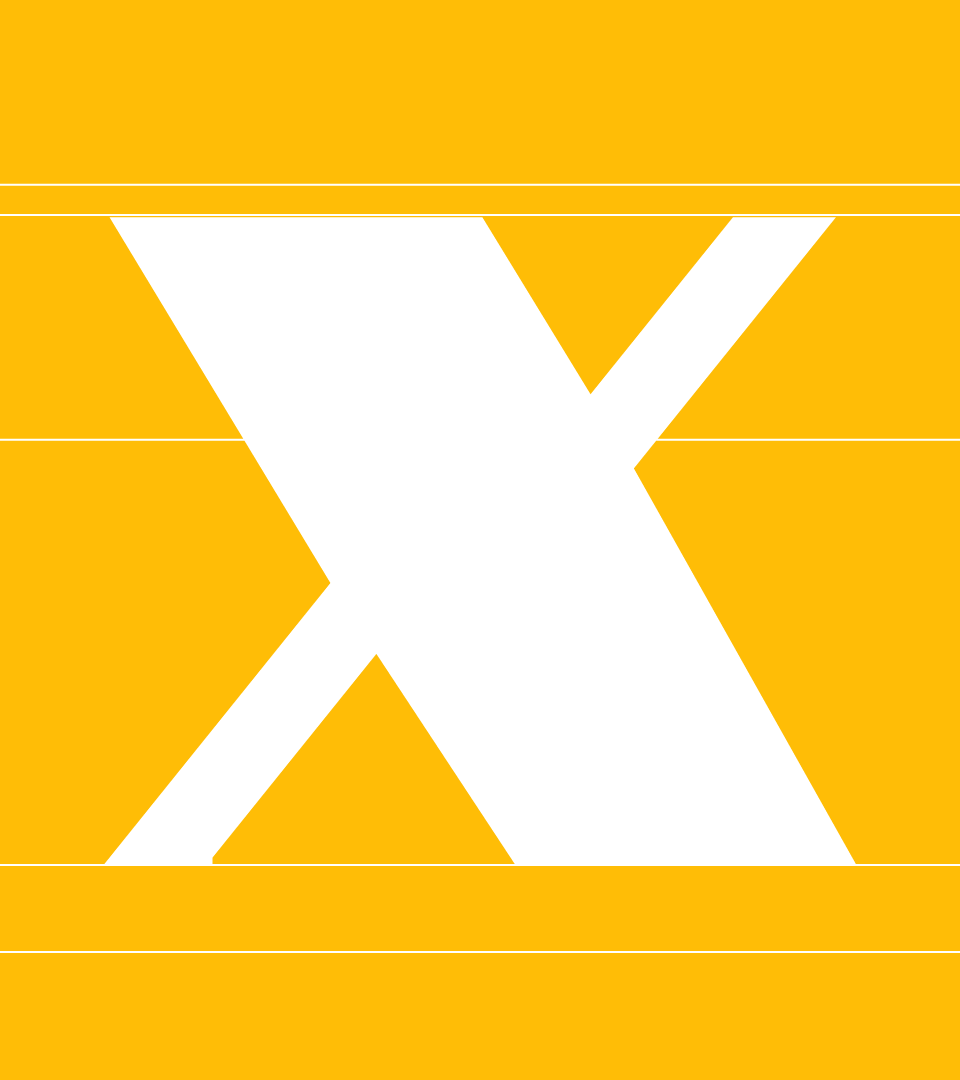
This question is answered by the result of my thesis project. We see that I have separated the FEELS font into two weights, Emotion and Perception, both of which are defined with abstract parameters. These abstract parameters have assisted me in creating my letter forms. To breakdown each weight, I shall start with the Emotion Friendly face as it is the most obvious. When my survey takers selected fonts that were friendly, the most common trend was the appearance of rounded and soft edges. This allowed me to make the connection between that softness with the friendly emotion, so when using the typeface, sliding the variable slider towards that end softens all of the exterior corners. The truth can be said about the opposite end of the Emotion weight, which is aggressive. The Aggressive side makes my letter forms wider and bolder, thus appearing heavier when used. Now for the Perception weight, the letter forms are defined in a more stylistic manner. The Luxury weight of my font is reminiscent of older, classic serif typefaces which many have associated with expensive brands such as Prada or Gucci. This means when adjusting the slider towards that side, the style of the letters are morphed to be more of that traditional letter form. If you take the Affordable side however, the letters are odd and rough. Stylistic it could be described as more brutal or harsh compared to the Luxury weight.
︎︎︎Lessons Learned
︎︎︎On the technical aspect of this project, I was able to achieve learning new programs that I have never used prior. One of which is Glyphs, the type design tool that allows for variable type design, Illustrator importing, and live font testing. This skill has definitely assisted me in discovering a program that is better suited for type design, a possible field I wish to pursue. Whether or not I use it heavily in my future, I can at least use it for certain purposes in future projects such as lettering. Through the applications part of the thesis, I also used the prototyping tool Figma. This skill asset allows me to add prototyping to the list of technical programs that I am capable of using at other jobs.
On the technical aspect of this project, I was able to achieve learning new programs that I have never used prior. One of which is Glyphs, the type design tool that allows for variable type design, Illustrator importing, and live font testing. This skill has definitely assisted me in discovering a program that is better suited for type design, a possible field I wish to pursue. Whether or not I use it heavily in my future, I can at least use it for certain purposes in future projects such as lettering. Through the applications part of the thesis, I also used the prototyping tool Figma. This skill asset allows me to add prototyping to the list of technical programs that I am capable of using at other jobs.
Part of the thesis project was to focus on the overall theme of transformation. Throughout my project, it has been an idea carried out both physically and abstractly. Physically, a variable type is a typeface that morphs and transforms into another version of itself. This is the direct correlation to the theme. In a more abstract sense, my project tackles the theme by allowing users to use a typeface that transforms the brand as it becomes better suited for its target audience. Using the Luxury weight opposed to the Affordable weight transforms the way people perceive a brand. Transformation is significant as users are able to change the way they are being perceived and may change a viewer’s opinions on them.
Special Thanks
To my thesis advisors, for the guidance throughout my process.
Professor Earl Gee
Professor Julio Martinez
Erik Marinovich
To my thesis advisors, for the guidance throughout my process.
Professor Earl Gee
Professor Julio Martinez
Erik Marinovich
To the SJSU BFA Graphic Design Faculty and Thesis Committee for the feedback, critique, and all the lessons over the past few years in the BFA.
To the BFA Graphic Design Class of 2021 for working together and staying up late to complete each step along the way.
To my friends and family who have helped pushed me with words of support and encouragement, especially during this project to help finish my college career.